
A space-age atmosphere and magic trees, copper crowns and floating mirrors – playful design and functionality needn´t be mutually exclusive in the cinema´s „hall of adventure“. We shine the spotlight on some successful examples.
About 200 years ago, shocked critics of architecture came to a decision: in view of the fashion for the oriental and the exotic, which was getting out of hand, they differentiated between “serious” architecture and buildings of a “wordly, merry character”. The serious, antiquity-orientated language remained reserved for town halls, prisons, courts, museums and the like. Dissipated design, characterized by arabesques, was found above all in coffee and summer houses, mansions, mosques and Turkish baths.
The standards valid at that time could still serve us well today: they would make it easier to see swimming pool complexes, leisure centres, musical halls or cinemas for what they are, namely „entertainment architecture“. The classic modern age of Bauhaus made us forget this division. Ist protagonists preached „form follows function“ – cinema auditoriums, in accordance with their function, were reduced to fire-resistant ceilings, minimum hight and minimal distance between the rows of chairs – as can be read in the „Building Plans Theory“ of 1936 by Gropius-pupil Ernst Neufert, a kind of bible for the planning architect.
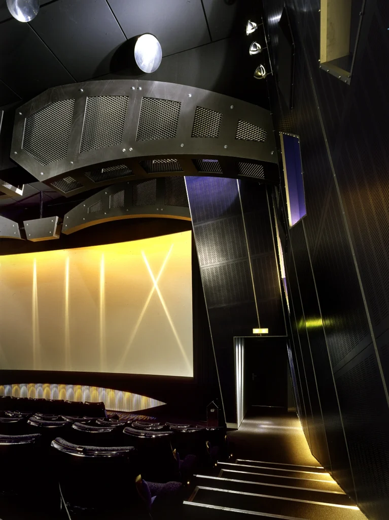
The Munich planning office of Barbara Adelmann and Anne Batisweiler has developed a spezial strategy fort he furnishing of cinema auditoriums. It has already been put to the test in ten, fort he most part converted, auditoriums. Whit this concept, the auditorium is supposed to give a foretaste of the illusionary level of the film to come. This should not, of course, be taken to mean that the auditorium´s architecture presents warlike sabrerattling before a fantasy film, visionary follies before a science fiction film or pink bows before some gushy romantic indulgence: the two architects do not indulge in such flights of fancy. They create each auditorium based on a motto orientated towards the requirements and spatial constants. Auditorium B of the „Royal“ cinema on the Goetheplatz, for instance: the „spaceship“. The room already had a conical form. In order to reinforce the impression of a space capsule, the architects tilted the wall panels out of the vertical plane, they now point upwards at an angle. The constellations of stars above and below further intensify the spaceship effect.
Despite all this fantasy, the combination of form and function is striking. The two designers are not fans of Arabesque-like decoration. Thus the little parabolic mirrors on the ceiling serve to divert the light from the spotlights fixed between the wall panels onto the blue seats.
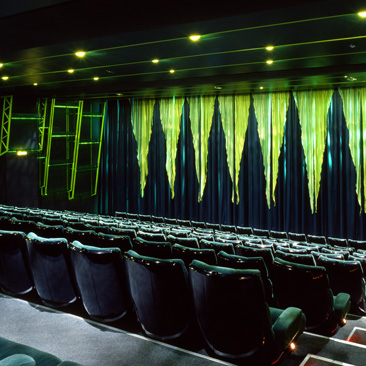
In the „Dragon Room“ of the same cinema, Batisweiler and Adelmann took their inspiration from the thick pillars, supports and recurring alcoves. The feeling of being inside a huge reptile took on aesthetic shape. Every element of the auditorium is done in garish shades of green. The curtain was fitted out with shimmering, sharp points which look like scales on the seaweedgreen fabric, and the zigzag form of the ceiling is reminiscent of a reptile´s skin.
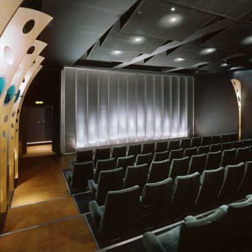
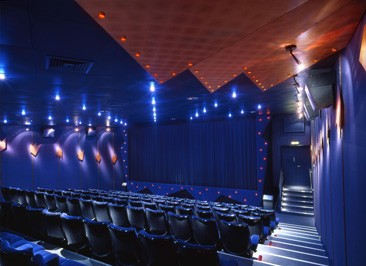
The „Kings´s Hall“ is less dangerous and fitted out with royal blue chairs. Here it is above all the perfect details which catch the eye and reinforce the majestic impression. Both the velvet upholstery on the doors and the thin strips of copper on the plum-blue wall covering are mounted with genuine studs. Cooper crowns and plates on the ceiling, illuminated by spotlights, playfully complete the noble ambience.
In the „Dragon Room“ of the same cinema, Batisweiler and Adelmann took their inspiration from the thick pillars, supports and recurring alcoves. The feeling of being inside a huge reptile took on aesthetic shape. Every element of the auditorium is done in garish shades of green. The curtain was fitted out with shimmering, sharp points which look like scales on the seaweedgreen fabric, and the zigzag form of the ceiling is reminiscent of a reptile´s skin.
The „Kings´s Hall“ is less dangerous and fitted out with royal blue chairs. Here it is above all the perfect details which catch the eye and reinforce the majestic impression. Both the velvet upholstery on the doors and the thin strips of copper on the plum-blue wall covering are mounted with genuine studs. Cooper crowns and plates on the ceiling, illuminated by spotlights, playfully complete the noble ambience.
With all these interiors, there is no denying the proximity to film architecture. A good many of them could serve as a backdrop for a film. Only at first glance is this surprising. Anyone who knows that Anne Batisweiler has been giving lectures in the „set design“ department of the interior design faculty at the University of Rosenheim will also know how these productions came about.
Source: designreport 10/1995
Author: Joachim Goetz
Publisher: MACup Verlag GmbH


